If you’ve read a few of my articles in the past, not only are you a total legend, but you are also probably aware that I give Zuckers and his team a bit of a hard time for their incessant changes that are mostly poorly communicated and largely useless.
However, there are rare occasions when they do something that is pretty awesome and/or exciting and that actually makes our lives easier. These occasions are worth celebrating, talking about, writing about and overall obsessing over due to the fact they are so completely unexpected. The problem is that they are STILL poorly communicated, and normal plebs who don’t devote 90% of their day to reading about social media (OK, so maybe 10% reading about it and 80% chatting on Facebook) tend to miss the boat.
That is where I come in. To use one million words to explain to you something that probably ten could do, but explain it nonetheless. So here’s my latest heroic Facebook information session for all of you who own a Facebook page (and as I’ve outlined in my previous post about managing a Facebook page, you are pretty much a loser if you don’t).
In order to reach a million words, I wish to start with a bit of a story. Once upon a time, there was an evil social networking-creating genius (let’s call him Zuckers) who created the world’s biggest and most lucrative digital network. He marveled over how easy it was to get hundreds of millions of people to hand over all their personal information and be part of this network. It was all so easy for him, despite the fact some doofkopf twins were trying to take him for all he was worth, just when he was starting to land some seriously fine ass from the whole rich and famous thing.
Anyway, because of the evil part, he decided he wanted to try and mess with these people and at the same time, make it difficult for others to capitalize on his creation without putting in some serious time and effort. This is where he came up with the creation of FBML, a coding language that developers were required to learn if they wished to do anything on HIS network. It was a pain in the arse and led to nobody doing much of anything other than whingeing.
THEN Zuckers had a particularly pleasing night at the Playboy mansion and decided that maybe he would make life a little less difficult for the trillions of Facebook users who were still hating on him from the latest Facebook profile update. He decided he would scrap his stupid network-exclusive code FBML and let people use iFrames and HTML instead. This opened up an entirely new world for people and businesses far and wide, and one of these opportunities was the ability to create a landing tab / welcome page for Facebook pages relatively easily.
The end.
*note: before you go into the details of how to create your Welcome Page below, I just wanted to highlight two other options in case you have problems figuring out the tutorial below and/or just don’t want to spend the time to do it. The first is to use a tool called Shortstack, which I talk a bit more about at the end of the article. The second is to get in touch with me because I design, code and implement Facebook tabs for people or businesses looking for effective welcome pages, competitions, contact pages etc. So if you need help, let me know. Otherwise, good luck in creating your very own Facebook welcome page!
NOW here is how you do it:
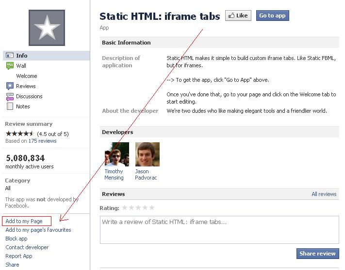
1. Install ‘Static HTML: iFrame tabs’ by visiting https://www.facebook.com/apps/application.php?id=190322544333196 and clicking ‘add to my page’ on the bottom left of the page
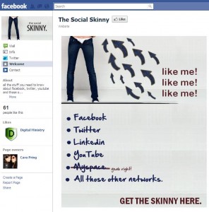
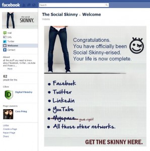
2. Choose whether you want to have a ‘reveal’ tab – this means that the people who visit your page who have not already liked your page will see a different tab from those who have. For example, see the two tabs below – the first is the reveal tab for people who have not liked the social skinny Facebook page, and the second is what those who have liked it will see:
I recommend that you do a reveal tab because here you can stick a big fat reminder for people to like your page (as above).
3. Create the images for your tab/s. If you don’t have Photoshop or anything else appropriate, try https://pixlr.com/. The image must be 520 pixels wide, but you can do however long you like – I did 600 pixels for my wonderful creations. Make sure you remind people to like your page! You can either design the one tab that everyone will see or design two – one for people who aren’t your fans and one for people who are.
4. Save your tab designs (I just saved them as jpegs) and upload them to the net so that they have a URL.
5. Go to your page and click on the ‘welcome’ tab – you will see something like this:
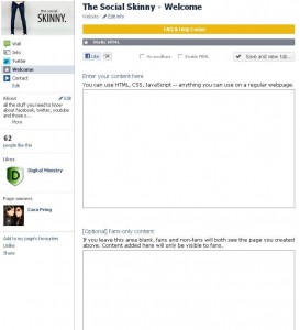
6. Enter the following code in the first box (the tab that people who have not liked your page will see):
<style type=’text/css’>
#wrapper {
width:520px;
height:600px;
margin:0 auto; border:0; padding:0;
position:relative;
}
</style>
<div id=”wrapper”>
<div style=’width:520px;’>
<img src=’insert image URL Here’ />
</div>
</div>
7. If you want to have a different tab that people who have liked your page will see, enter the same code into the second box, but obviously using the other image URL.
You will then have a welcome page and will probably get thousands (if not millions) of fans! If you do know a bit of HTML, you can jazz your page up a bit, but if you’re just looking for a simple branded welcome tab, that should work nicely, and it only takes a few minutes (depending on your design abilities).
Update: There seem to be quite a few issues with some people not being able to get the code quite right (I think it’s mainly those pesky apostrophes!), so I thought I might give you an alternative that could help. Shortstack is a fantastic tool that allows you to not only create a welcome page but other types of Facebook tabs (eg. contact form, competitions) for your page as well. It’s super easy to use and they do all the coding work for you. Even better, if you have less than 2,000 fans, it’s free (note: you will have some Shorstack branding below your tab). For those of you who have more than 2,000 fans, or if you don’t want any Shortstack branding, it starts at $15/month for a subscription. If you’re having issues, it’s well worth checking out.
